California Dreamin'
Sacramento, CA
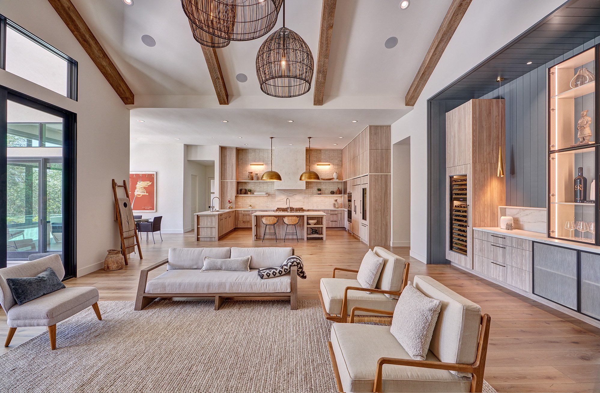
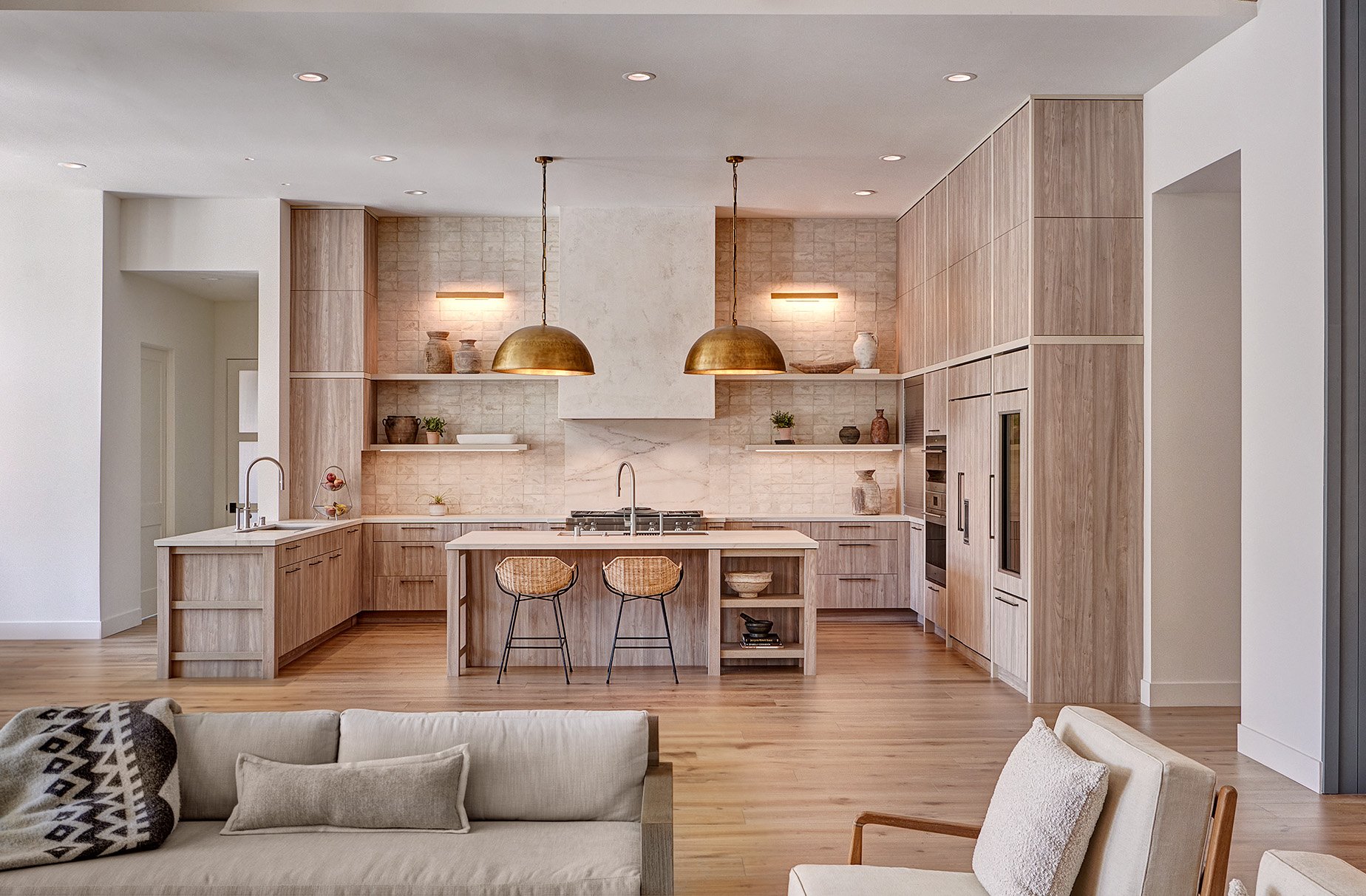
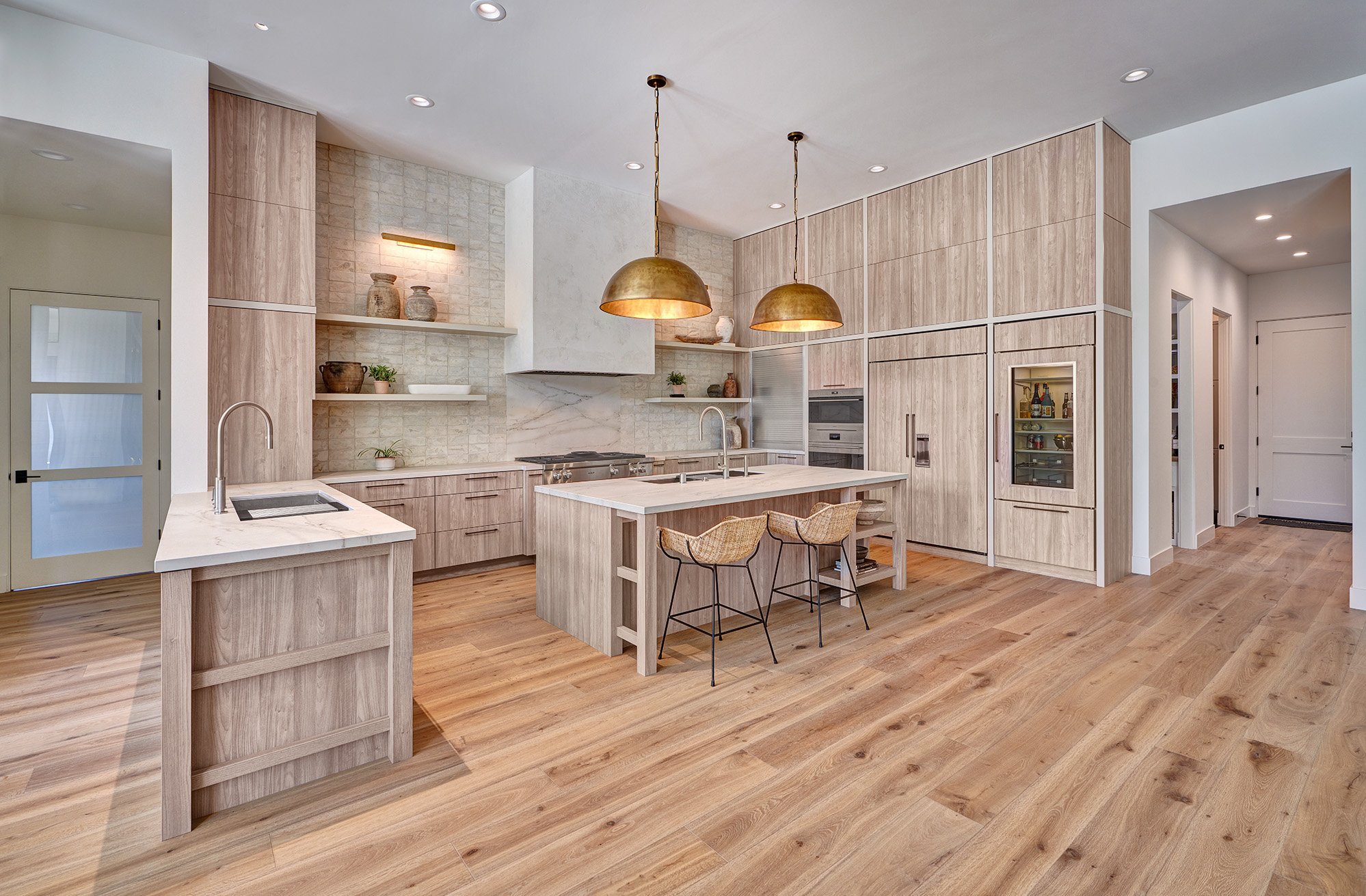
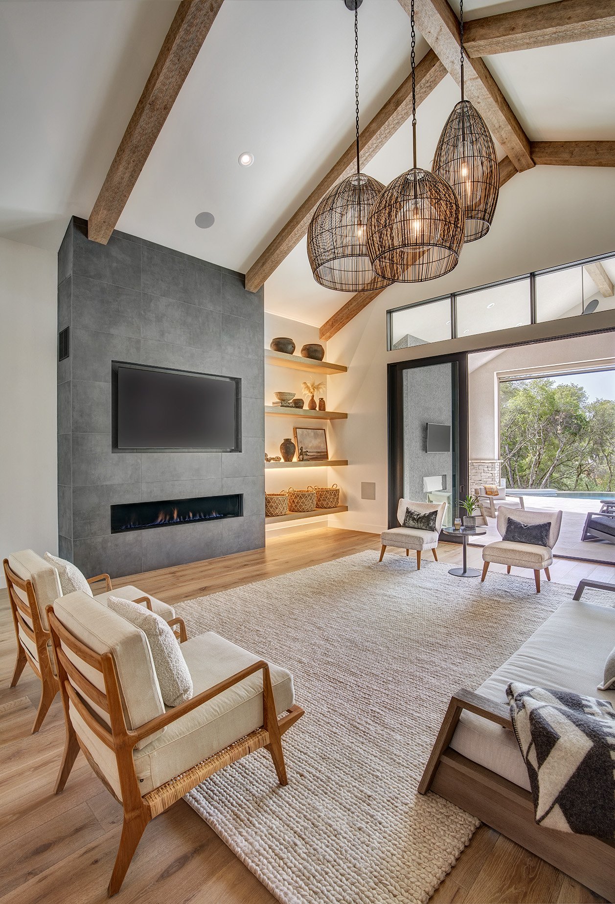
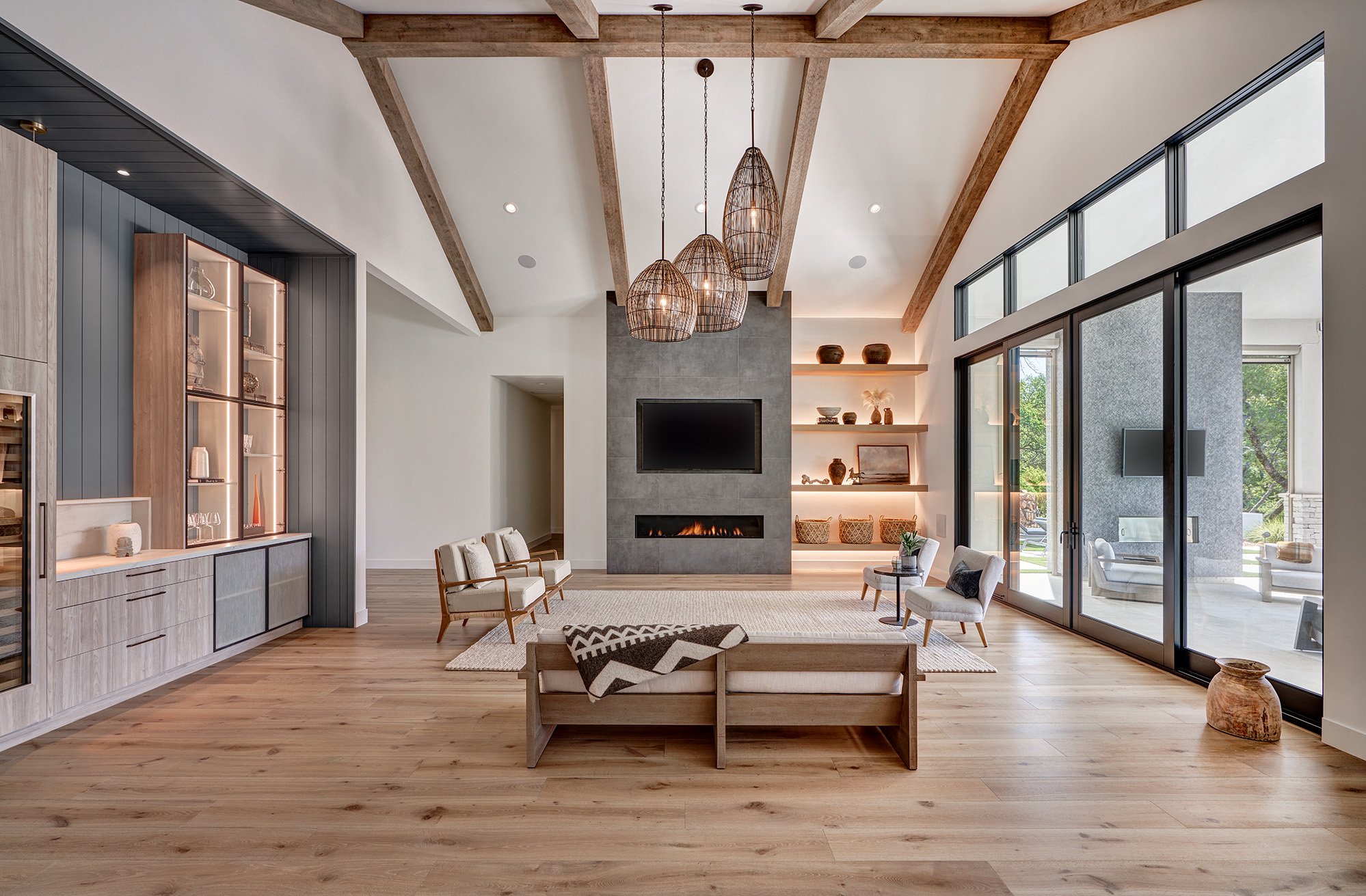
This new construction home was a blank canvas of open space with high ceilings and lots of natural light streaming in from the windows that overlook the wooded backyard. The client desired the kitchen to have elements within the pieces and materials that gave a feeling of history and character. This was quite the challenge in a new construction home with all new building materials. Dekton Rem was selected for the surfaces and backsplash treatment behind the Wolf range top for its visual depth and subtle texture. The hood was finished in a natural plaster finish. Although originally planned to be more of a refined plaster finish, when we visited the project one day with the client and saw the hood with only the first coat of plaster applied, we all agreed it was perfect as it was! The plaster finish elegantly tied into the warmth and character that we wanted to achieve. The backsplash selected is an aged brick look that perfectly picks up the warm cream and grey tones of the Dekton countertops and textured laminate cabinetry. It was set into a straight grid pattern rather than a running bond to complement the modern clean lines of the kitchen. The open legwork and display shelf details at the island inspired the long floating shelves that wrap the kitchen and transition into the trim elements of the tall appliance wall. These warm neutral painted cabinetry elements run both vertically and horizontally creating a dynamic grid that gives structure to the natural veining of the countertops and natural graining of the cabinetry. A rustic white bronze cabinetry pull was selected to complement the Gun metal faucets and stainless elements of the kitchen. Antique hammed brass oversized pendant domes and art lights provide a contrasting metal accent to complete the modern warmth vibe of this stunning kitchen!
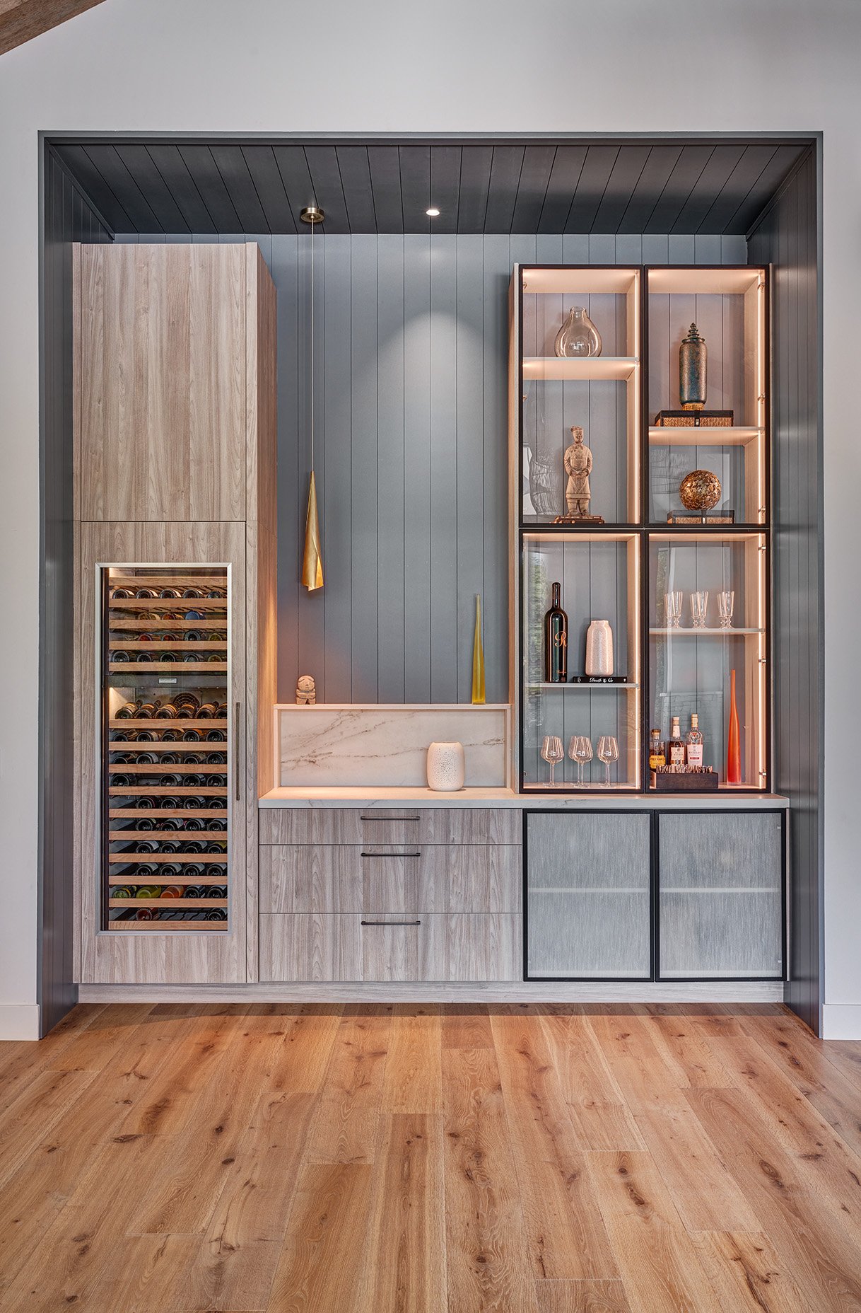
Adjacent to both the kitchen and living room, the focal point of this great room space is the bar. Being part of such an open area with tall ceilings, it was important to create a different identity for this space, making it feel cozier and more intimate. This was achieved by tucking the cabinetry into a tall niche, completely clad with nickel-gap paneling and painted in deep moody blue color. A combination of concealed storage and internally lit glass display cabinetry allows for form and function. The client’s wine collection is stored in the integrated wine refrigerator. An offset pendant in aged brass was used over the stone cubby as a decorative element and finishing touch for this asymmetric, yet balanced space.
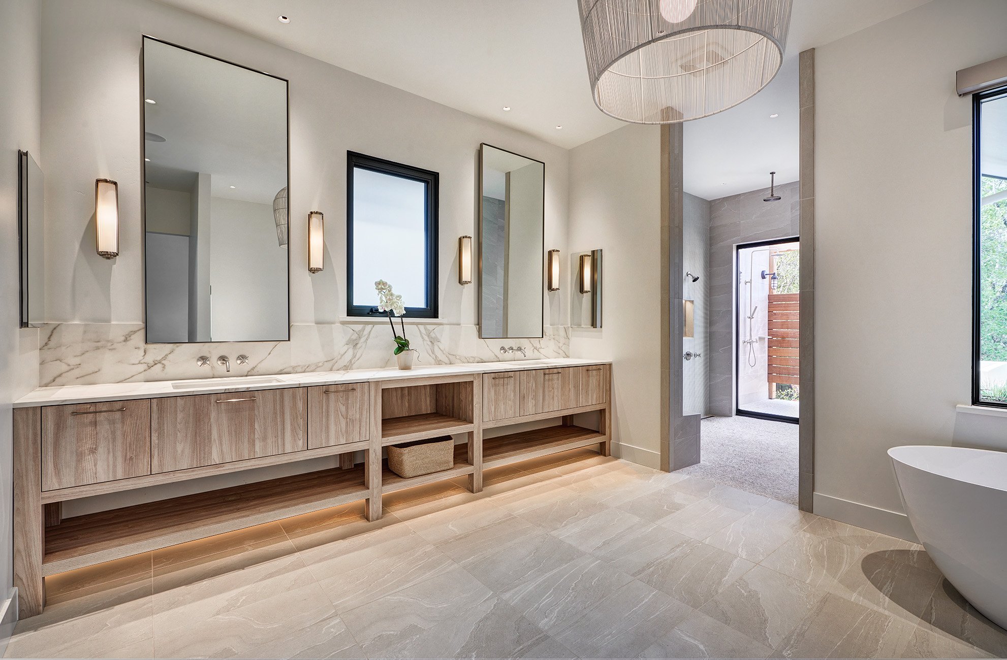
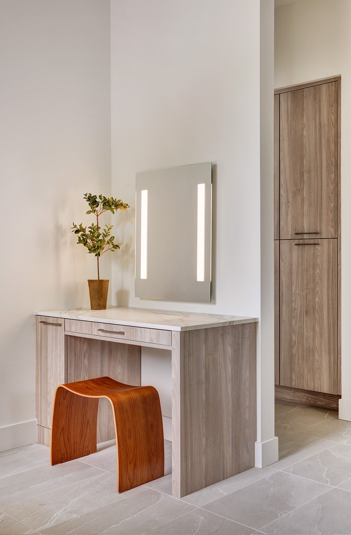
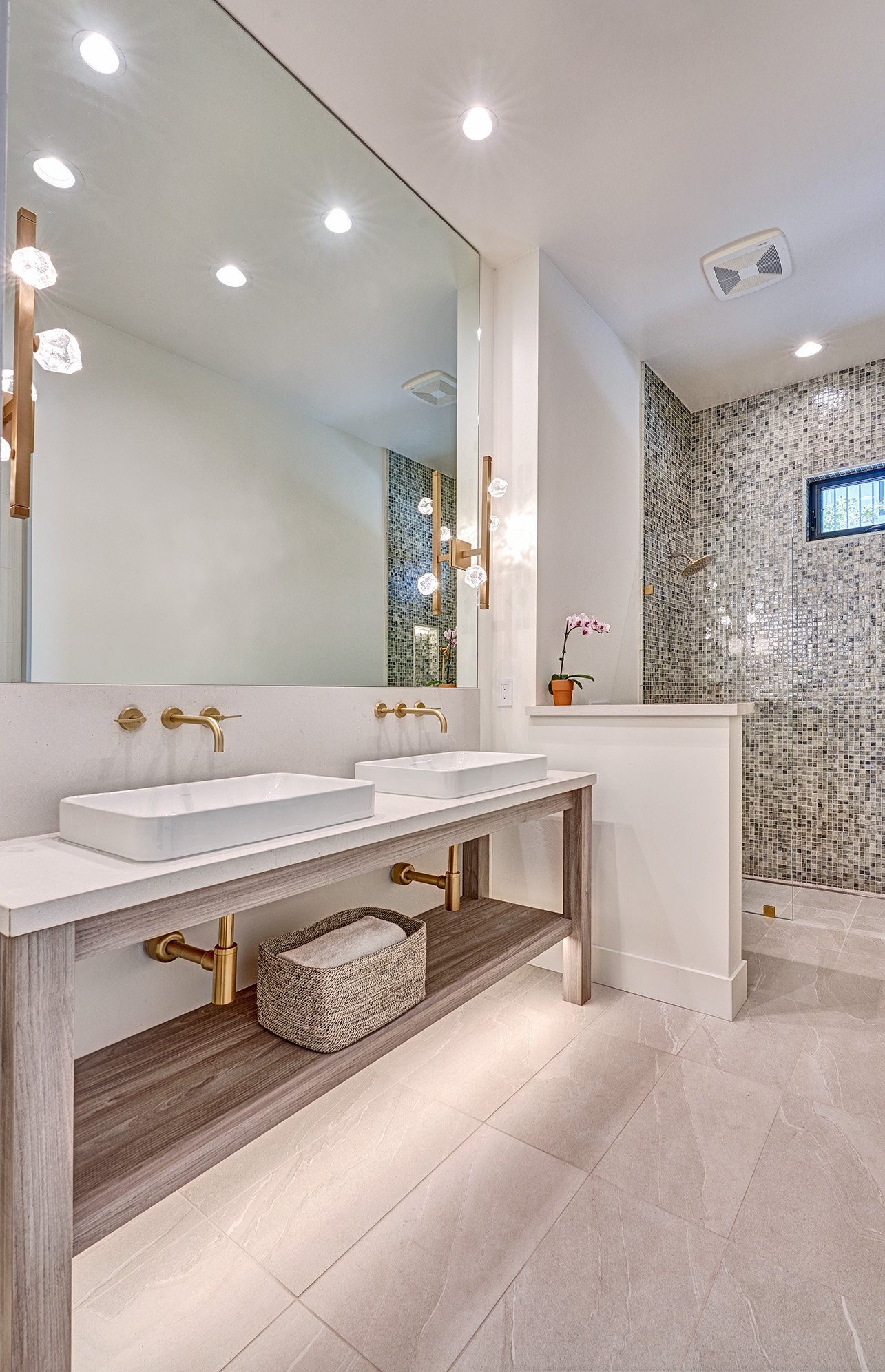
The clients wanted neutral, calming tones for their main bath, along with a wide double vanity that felt airy and floating. A freestanding tub along with both an interior and exterior shower create a wide, open space that feels spa like. A separate makeup area provides additional storage and function.
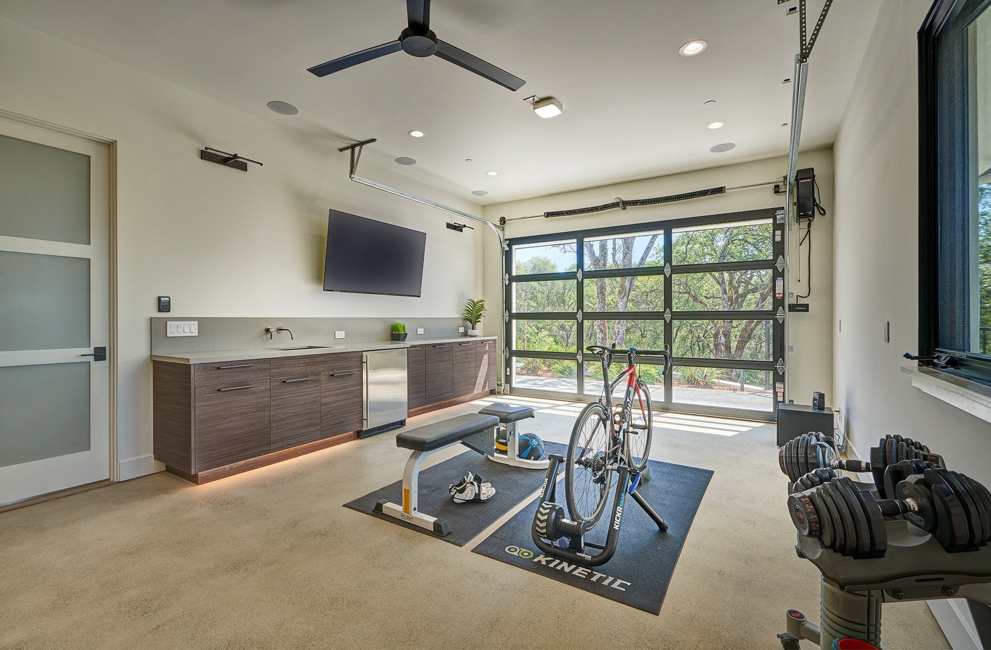
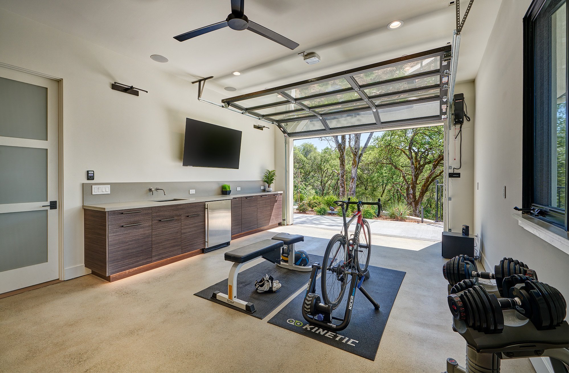
An avid cyclist, the client desired a space to work out in that doubled as an office. With a garage door, beverage refrigerator, sink and plenty of storage this space is both functional and serene.
Architect: Donald Joseph Inc.
Designer: Simply Savvy Design Studio
Designer: Nar Design Group
Builder: Wichert Homes
Photo Credit: Fred Donham of PhotographerLink
